
Purchasing Fabrics
- If you buy in inches, always buy 2–4″ more than the pattern requires. This allows for shrinkage as well as poor cutting in the shop.
- When buying fat quarters, make sure that they are true fat quarters; at least 20.5″ x 18″.
- All fabrics should be 100% cotton.
- They can be a mix of weights and weave, but not too loose, or too heavy weight.
- As some fabrics lose colour or shrink, they should all be pre-washed.
- It will be unlikely that you will be able to get all the colours in one shop, so you may need to shop around over time. When you do, make sure you take all the fabrics you have already purchased with you, as shades are really hard to guess at.
Selecting Fabrics
Overall Effect
Take care when choosing your fabrics, it can make a very large difference to the look of your quilt. Take into account the room in which you want to put the quilt. If you are giving it away, think about the colours that the friend wears most often or uses in their house.
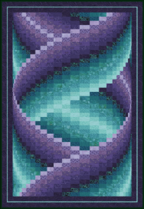
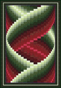
The two quilts below are the same design (“Tango”), but one has calm colours and the other dramatic colours, giving the quilts entirely different looks.
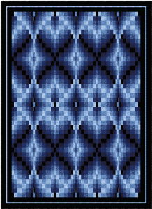
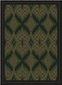
These two versions of the “Filigree” design also show that use of different colour ranges makes a big difference to the end result of the quilt. The green version—with little colour range—loses the filigree effect of the design, but is effective in its own way.
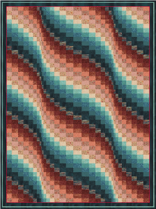
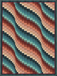
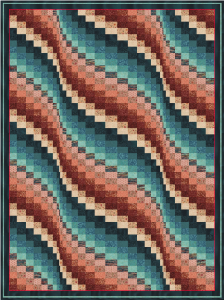
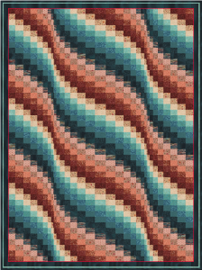
The order in which the fabrics are placed on the quilt changes the quilt as dramatically as different colours. These four versions of “Ripples” all use the same fabrics and the design is identical, the only thing that has changed is the order.
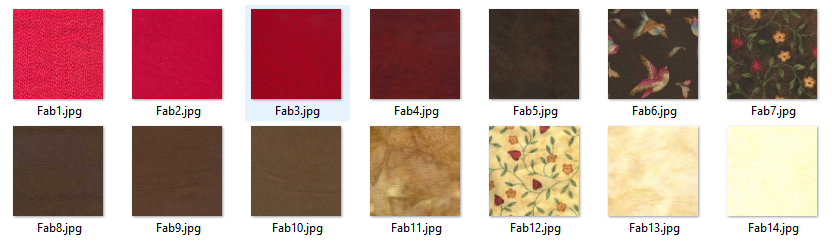
Types of Fabric
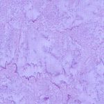
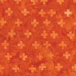
Plain and Tone-on-Tone
| Plain fabrics and tone-on-tone will always work. However care must be taken to ensure the quilt does not become too bland. |
|
||
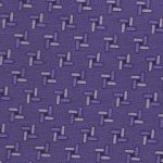
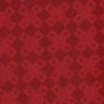
| Tone-on-tone small patterns will also always work. |
|
||
| However, care must be taken if the pattern has geometry; these fabrics must be cut parallel with the lines of the fabric’s pattern. |
|
||
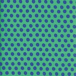
| Dots and stripes don’t do a thing for me, but you may like them. Stripes—like other geometric fabric patterns—need careful cutting. |
|
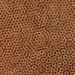
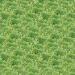

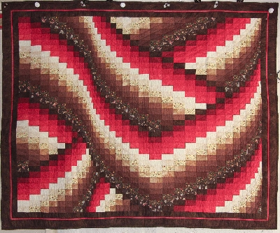
Small Patterns
| Small patterns are really nice in a bargello quilt, with contrasting colours giving the quilt interest. | 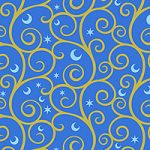 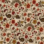 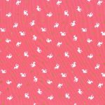 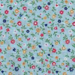 |
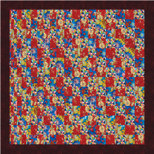
This quilt (“Crossings”) shows clearly the use of plain, tone-on-tone and small patterned fabric. Note how the small patterned fabrics pick up the colours elsewhere in the quilt, and how the pattern for Fabric 7 is actually the same as Fabric 12.
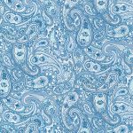
Fabrics to be Wary of
| Fabrics with a large variation in shades can be effective if used sparingly. Care needs to be taken to ensure that it does not spoil the effect of the colour gradation. |
  |
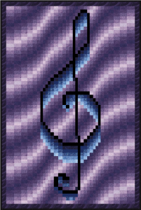
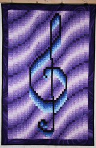
The images below are of the “Treble Clef” design, as designed on the left and as made on the right. The use of a fabric with varying colour as the darkest purple does, to some extent, spoil the effect of the background, particularly in the area just above and to the left of the treble clef itself.
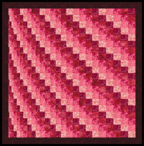
| In the design on the right (“Sweep”), the fabric with a high level of variation is in the middle of the set of colours and works quite well. |
|
Fabrics to Avoid
| Fabrics with a large variation in colours and large patterns are probably best avoided, as they will spoil the normal bargello effect .It is possible to end up with quite a mess, with the shape of the bargello completely lost. Compare “Sweep” on the previous page with the one below. |  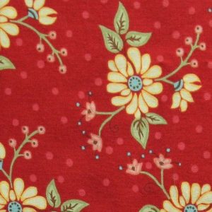 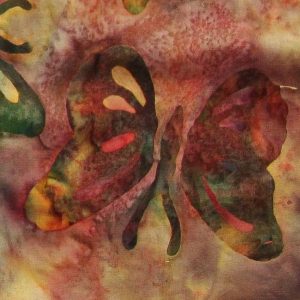 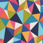 |
| Wide stripes should never be used. | 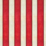 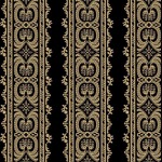 |
||
| Although the one on the right might work if the fabric was rotated and the main stripe matched the strip height |
|

Transition Fabrics
| Fabrics that include both the colours of the adjacent fabrics can look really good. |
![]()
![]()
The quilt on the right below (“Vibe”) uses three transition fabrics.
|
|